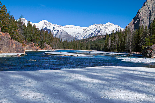
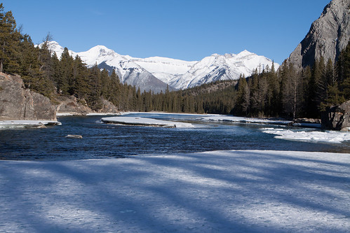
I took the above picture near Bow Falls, within the town of Banff, in Banff National Park, Alberta. And below, is the same picture but straight out of the camera. As you can see, I enhanced the colors. You can click on either photo to be taken to a larger version at Flickr.
By being a beta-reader, I am helping Dan Margulis, a friend and a best-selling author, write a new book on Photoshop. I, along with 13 others, am proof-reading his text, making sure that everything flows, the discussion and examples can be readily followed, and, we hope, there are no typos.
For those that are unfamiliar with Dan, he has already written several highly acclaimed Photoshop books, including: Professional Photoshop: The Classic Guide to Color Correction (5th Edition); Photoshop LAB Color: The Canyon Conundrum and Other Adventures in the Most Powerful Colorspace; and Modern Photoshop Color Workflow The Quartertone Quandary, the PPW, and Other Ideas for Speedy Image Enhancement (Amazon affiliate links). We are working on a follow-up or revised edition to his Canyon Conundrum book.
Although I am strictly an amateur photographer who enjoys working with Photoshop, I have read Margulis’s books, which many readers consider difficult but worthwhile, and have taken two of his courses. That said, to become extremely good at photography and Photoshop, one needs to gain considerable experience with each. I am improving, slowly but surely. Every time I take a new photograph and process it through Photoshop, I learn something new.
To keep learning, I am observant and willing to experiment. As mentioned in my photography articles, I compare my results to what I had envisioned. That usually helps to spot mistakes quickly. And, I am willing to try different techniques or methods, both in photography and Photoshop.
Returning to Dan’s book, the beta-reading exercise is a challenging but rewarding endeavor. The challenge is to understand everything and that takes some effort. I have had to read some parts two or three times. Because of my limited experience and proficiency, I might be working harder than others in our group. That said, we each fill a certain demographic of Dan’s expected readership, so I am helping to fulfill the serious amateur role. Moreover, each of us works independently to provide feedback. As I have commented to others, being a beta-reader is much like being a student taking a graduate level course—it takes a lot of hard work and effort. The great news is that it is rewarding because I have the opportunity to gain more insights and experience.
As you’ve seen from a prior post, on February 23, I went out to Banff to take photographs. My favorite photograph from that day is the one at the top of this article. The most difficult challenge I had in retouching it in Photoshop was the blue shadows on the ice immediately in front of the camera. I deliberately brought out color variation from the trees and the rocks, but that move also intensified the blue shadow, so much so that it looked garish in my first iteration. One of the unfortunate aspects of working for a while in Photoshop is that you become inured to overly strong colors. Soon, they begin to look proper and normal. It’s only when you step away for a while or someone else comments on your photograph that you begin to see the problem.
In this case, I was unsure how to treat the overly blue shadow. Dan has an online Color Theory Group where other enthusiasts can exchange information. I posted my dilemma and asked for help. Another enthusiast Les De Moss came to my rescue. He just happens to be a former beta-reader for Dan’s books, just happens to own a color lab, and just happens to live in the Rockies. He provided a sample file where he showed how to split the file into parts and treat each separately. So everything but the ice was one part, which I already had completed, and the ice with the blue shadows was the second part. Once I knew how to treat the ice, I didn’t take long to finish both parts and recombine them.
All that said, I am happy with my final result. You, of course, will have to form your own opinion.
Every exercise increases my learning and experience. In this instance, I learned how to work with blue shadows on white snow and how to separate and recombine parts of a photograph. The other positive aspect of this type of learning experience is helping and receiving help from others—a little help from my friends.


Learning is great. But learning isn’t enough. Practice is what translates learning into getting better and better. Shoot more. Get better. Guaranteed. Read more about shooting (or Photoshop) and getting better is not guaranteed. In fact, there’s a better chance, almost a guarantee, you won’t get better at all. But you’ll know more in a removed-from-doing-it sort of way. Anyway. Just saying. Good article, Kevin.
Thank you for commenting Jimmy. I wish I could offer you a prize for being the first person to comment in my blog. One of the days, I will have to provide you with something.
With regard to your comment above, I agree completely. I need to get out more and just make it happen. Every time I am out snapping photos, I learn. Thank you for your encouragement.
Thank you for the two photos. It’s interesting to me how my eyes immediately prefer the higher contrast but after further study, the “natural” photograph becomes a favorite for the soothing properties in it. (although that blue sky in the top photo is absolutely beautiful)
It helps to have an understanding of the process which you go through to achieve your photographs. I tend to take the beauty of your work for granted, something I never want to do.
Thank you for your comment, Donna.
Regarding the first image, yes, it has higher contrast. I deliberately find the brightest point and make it as bright as possible while still holding some detail, and I find the darkest point or almost completely dark to make it very dark or black. So, yes, the contrast is stronger, with more saturated colors. Moroever, the photographed has been sharpened, which even on its own has a pronounced effect.
As in makeup, you often look for complimentary colors. In my process, I deliberately pull colors apart toward their complimentary colors. On one axis, I have magenta and green. And, on the other axis, I have yellow and blue. Looking at my trees, for example, we see in the original photograph that there are hints of reds and oranges mixed in with the greens. In my retouched version, the reds and oranges are much more distinct and sharper. Similarly on the rocks on the camera left hand side, the original version is rather bland, whereas my version is rather colorful.
As far as the sky is concerned, that’s a slightly more challenging issue. Skies are very blue along one color axis with sometimes just a hint of green or magenta along the other. When my process pulls colors apart and emphasizes them, the green component in the sky often becomes too strong. So I the reduce the green component and then decide how blue the sky should be. Because the rest of my photograph has become very colorful, the original sky wouldn’t quite seem to fit. Yet, I blended the original sky into my modified sky. The sky, too, is a judgement call.
In your response, you indicated that you liked the original photograph because it was soothing. That’s true. My version is loud. It practically screams at you with color. The volume is an individual taste. Some prefer more muted and some even mute the original colors in their photographs. My version is louder, like a postcard. And, Dan’s process is called Picture Postcard Workflow.
If you go back to the film days, some films were louder than others. In fact, part of the black science was knowing which film would provide the best reproduction. In digital, of course, we have more control.
Well said! Thank you for the explanation. It is interesting the loud gets the first attention, the soothing keeps the focus. This would be a good lesson for some people to learn (not you Kevin, you’re never loud). 🙂